The 49ers Alt Uniforms
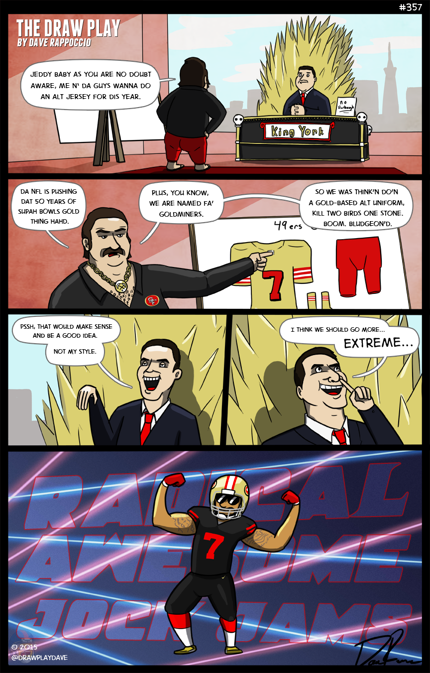
Think you were clever, did you, 49ers? Trying to sneak out the new alt uniforms on draft day so they don’t get any attention? Sneaky Sneaky.
I don’t particularly like the new 49ers alt unis. I could go into detail but I think Paul Lukas of Uniwatch pretty much nailed down all my gripes with it, and his takedown is spectacular. Everyone should read it.
To me, it feels not only 90’S RADICAL BLACK it feels like they were not very well thought out. The actual design is whatever, all black with slight color highlights is a look that I’ve always personally liked (The Eagles all blacks last year, I loved them, and I you know how much I hate anything Philadelphia) but this just…doesn’t work. There is too much black. It looks somewhat reasonable against the immaculately photographed and touched up black backgrounds of the promo pictures, but good photography won’t make it look better on the field. It’s kind of like how the Jags helmets look almost passable with good lighting and photography but on gameday look like ass against the grass. I don’t think these unis will look nearly as sharp on the field as they do in the promo shots, and they already feel questionable in the promo shots.
But really, to me, the biggest crime isn’t the black, it’s the complete lack of gold anywhere on the uniform (outside the very small nike swoosh on the upper pants). Seriously? Not only does it create a terrible disconnect between the gold helmet, but the goddamn team is named after A TERM FOR GOLD MINERS. That’s what a 49er is! It’s a gold miner! WHY THE HELL AREN’T YOU PUTTING GOLD ON A UNIFORM NAMED FOR GOLDMINERS? Frankly it’s almost a crime that the 9ers don’t have a gold alt jersey to begin with! They couldn’t even put a gold stripe on the jerseys? They couldn’t make the numbers and stripes gold? No gold trim? Add on the fact that the NFL is doing this GOLD EVERYTHING theme for the 50th Super Bowl year, and the decision just gets even dumber. They missed such a Golden opportunity (You’d better believe that pun was intended).
Also, I wonder the intelligence of having a black uniform for a stadium that apparently gets pretty damn hot. I hope they plan to play these uniforms for night games, because they look like a bright sunny day will murder them.
I give Nike a lot of shit but these uniforms were player requested, which answers a lot of questions. I’d wager a lot of these players grew up in the 90’s when BLACK WAS X-TREME AND RAD AND WASSSSSSAAAAAAAAAAAP, so they saw Kaep’s black practice jersey and said “Man that’s cool, because I have bad taste, and I want everyone to share my bad taste”.
———-
Anyway, I’m sure you noticed the new header. Let me know what you think about how it looks, I was aiming for a sort of sunday paper comic title, with the title incorporated into the image. I’ve had recent troubles with jerks taking popular comics and cropping my name off the top (Seriously, these people are scum, if you ever see a DP comic on the web with my name cropped off call that person out for me) so I’m trying to fit the important stuff on the image itself so it’s that much harder to edit out by scumbags trying to steal it.
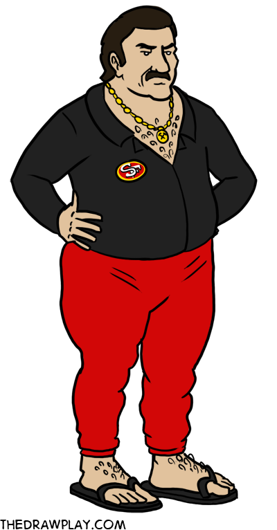
Be sure to check out the entire collection of my 2015 draft picks, and I’ll leave you with Jim Tomsula the Mic Rula because it never gets old


Like the new header. Better than the awful “watermark” that some comic artists puts in to make it hard to copyright.
Also have you considered filing DMCA notice to jerks stealing your work? Usually works every time.
If they had made an alternate helmet to go along with it and made it less of “none more black with everything but the numbers black” and actually added some color like the Eagles, Ravens, and other teams that do all-black alts right, I’d like them. Honestly though, I disagree with a lot of Mr. Lukas’ gripes about it; either he has really poor vision or I have really great vision, because the red numbers and letters aren’t hard to read at all from where I’m sitting, and a gold alt would look ostentatious. NFL uniforms aren’t supposed to be flashy or gaudy, they’re supposed to be simple, to-the-point, and sane-looking. It’s why the neon green Seahawks looked awful, why the creamsicle Bucs never looked right, why the best uniform redesign is the Vikings, which is basically a 70’s throwback with a stylized font. Gold uniforms scream “I’m better than you”, and not in the good, Strahany “I’m a better player and that’s just stating a fact about the disparity in our ability” way, in the spoiled rich dude “my parents bought me a fancy car and are paying my rent on a condo even though I don’t know shit so I’m better than you” way.
I’m not a fan of them, but I don’t think they’re horrible. Just a disappointing blob of wasted potential for what could’ve been a really good look if they put more effort in than just “BLACK JERSEY AND PANTS WITH RED NUMBERS WE’RE GENIUSES”
People are cropping out your header? That’s a pretty crappy thing to do, but this header seems like the way to go, it’s unobtrusive, but at the same time trying to crop it out would make it really obvious that the comic has been edited.
Jed York, the man who scalped Son Goku. And in Super Saiyan form too.
I like the uniforms but the helmet doesn’t match. I hear they are not allowed to use alternate helmets.
I never understand why people give a shit. It’s not a permanent change, it’s just for fun. It’s not terrible, and its not the end of the world line some fans act.
If the jerseys were all gold and had little red 49ers on it, then it would be ugle as shit. Id understand people losing their shit. Instead it just a way to mix it up. People need to just grow up and get over it. There are way more important things to give a shit about. Like…you know, how welll the players actually play…
Hey look, I found the 15 year old
My god…. I love the ATHF reference at the bottom. I’m dying.
For some teams, a black uniform fits the theme they’re going with. Obviously, the Ravens, Jaguars, Bengals and Panthers should have black unis, because those animals are all at least partially black. And the Saints and Raiders have black as one of their colors so that makes sense too. The Eagles can pull it off because they wear a shade of dark green already, so black isn’t that much of a drastic change for them.
The 49ers just look sad. Like a forty year old man trying to look hip but having his idea of cool coming from the nineties. Why go black? The Niners already look too much like the Saints in their white uniforms, so they went and decided to use the Saints’ other color? There’s already a red colored team with black alternates in the NFC West(the Cardinals) so bonus points for unoriginality.
P.S. I was actually at the game where the Seahawks wore those neon green jerseys. They were blindingly hideous, but also kind of endearing. That green design had been available for fans to buy for some time before then, but I had no idea the actual team was going to wear them. I have a green Lofa Tatupu jersey with his signature on it and they actually look pretty good when not being worn by the players with that shade of blue that clashed horribly with them. I hope they start making green jerseys in the new style. I think they’d look cool.
Because I’m old, it reminds me most of Spinal Tap releasing an all-black album cover following the controversy over the original cover artwork for “Smell the Glove”.
“It’s like, how much more black could this be? And the answer is none. None more black.”
Not a fan now, but I guess we have to see them in game situations before we hate em, right?
I appreciate your portrayal of York. I feel bad for my wife– she’s a life-long 49ers fan, but York is showing the signs of Senile Al Davis already. He’s a worse Snider. My Mrs. will have grandbabies before the 49ers are relevant again unless York sells the team or dies early.
BOOM. BLUDGEON’D.
This is pretty cool because it reveals the inner feelings that the 49ers have for their NFC West rivals the Seahawks.
Only problem is, there’s already a black team in the Bay Area, and that’s Oakland.
I think you bring up a lot of good points. I agree with pretty much everything you say in the article. Jed York better smarten up or the Niners are going to be f****d for the next 10 years.
Jed York looks like he’s picking his nose in the 2nd-to-last panel.
So take this black jerseys, keep the gold pants, and you know what they’d look like? Jim Harbaugh’s signature khaki/sweater combo. Coincidence?
As a Seahawk fan, I love your imitation on Jim Tomsula Lol! Hope to see more of the mic rula.
Is Jed York picking his nose in panel #4?
The gold looks like the 4 erstwhile first ever NFL uniform they wore in 1950
49ers Damm auto correct
Damn auto correct
LOL! Now I will forever think of York as the Lemur King from the Madagascar movie franchise.
The Pats are cheaters and Tom Brady is a liar Dave you got it
Where’s the Sexy Rexy?
And really, isn’t that all the proof you really need?
I love this cartoon, but I must say… Jim Tomsula has a definite likeness to Carl from Aqua Team Hunger Force
http://upload.wikimedia.org/wikipedia/en/0/00/Carl_Brutananadilewski.png