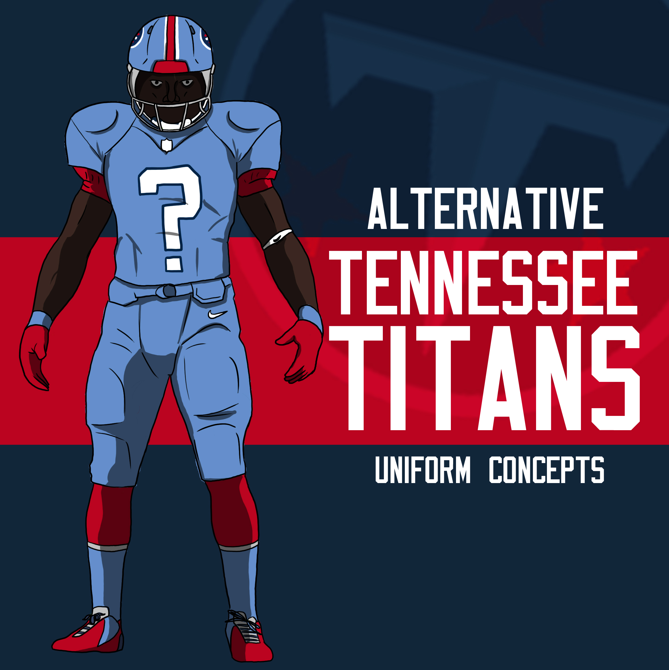
Alternative Titans Uniform Concepts
So allow me to do something a bit different.
Since I left Uproxx in late 2016, I haven’t really had a place to put my stupid non-comic things. KSK was essentially my outlet for that. Logos, drawing lessons, prediction cartoons, and other weird, stupid crap. (Apparently Uproxx has removed the links to some of my older content, guess it’s time for a re-upload here soon. Some of that nonsense was worth saving)
Since I don’t really have time to make my weird dumb side content ideas for other sites anymore and keep up with 3 comics a week, I figured I’d just occasionally start replacing Saturday comics with alternative stuff. Not every week, probably not frequently at all, but occasionally. Stuff like this.
So the Titans came out with a meh redesign earlier this week. I like to rally and offer lots of critique whenever Nike makes changes, but I rarely offer my own work as a counter example. Mostly because I’m lazy and cannot take anything too seriously. I figured I actually would try that this time. This is a semi-serious attempt to have a little fun with design ideas.
None of these are “finished” concepts. All of them are basically me screwing around with some ideas. Since my analysis of the Titans new look was that I wish Nike had pushed it farther, I decided to actually do that and build a few simple concepts out of some of the ideas I had. Most people will probably hate this because there are too many traditionalists who think football uniforms all have to look basically the same with slightly different colors, while I think we could be moving into more interesting territory just to see what sticks, which is something I appreciate Nike for. Without further adieu:
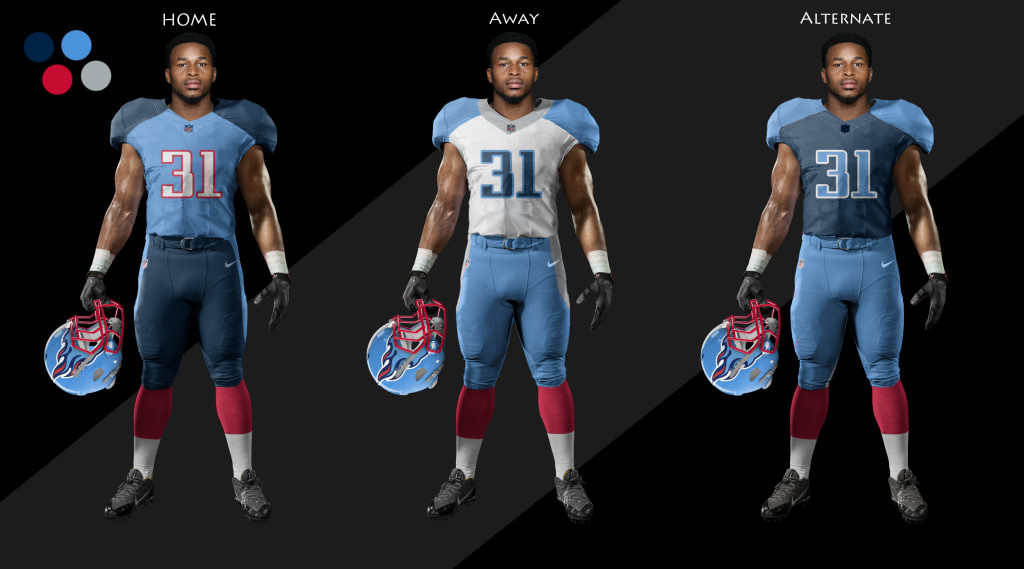
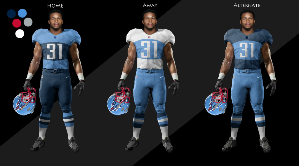
I call this one the basic. I like heavy shoulder pads. I changed up the main uniform to be primary light blue, which is a theme I kept through all of them. I firmly believe the Titans should use the light blue as a primary due to it looking better and being more unique. Especially if they had a light blue helmet. I’m also a big fan of helmets that aren’t just the logo slapped on there. I think the flames offer the Titans a really great opportunity for a cool helmet and they aren’t capitalizing.
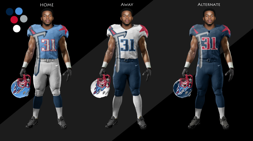
I call this the SWORD SHOULDER look. MORE SWORDS. The sword connects around the back behind the name. There are also swords on the sides of the legs. I didn’t feel like finding another template to show that better.
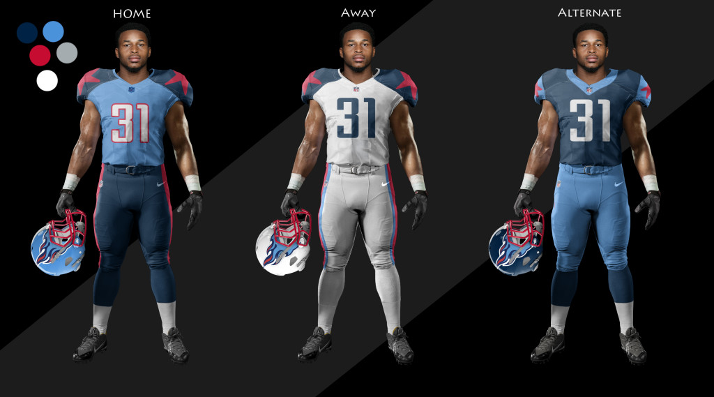
I call this STAR SHOULDERS. I like cool shoulder stuff okay. The Titans have stars on their logo from the Tennessee Flag. Stars are good, include them in the outfit more. Steal some of that Cowboys mojo.
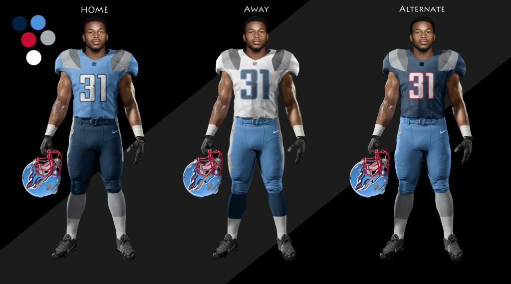
Just playing with the idea of making the jersey multiple colors in a different way. It is a little closer to the rugby roots of football.
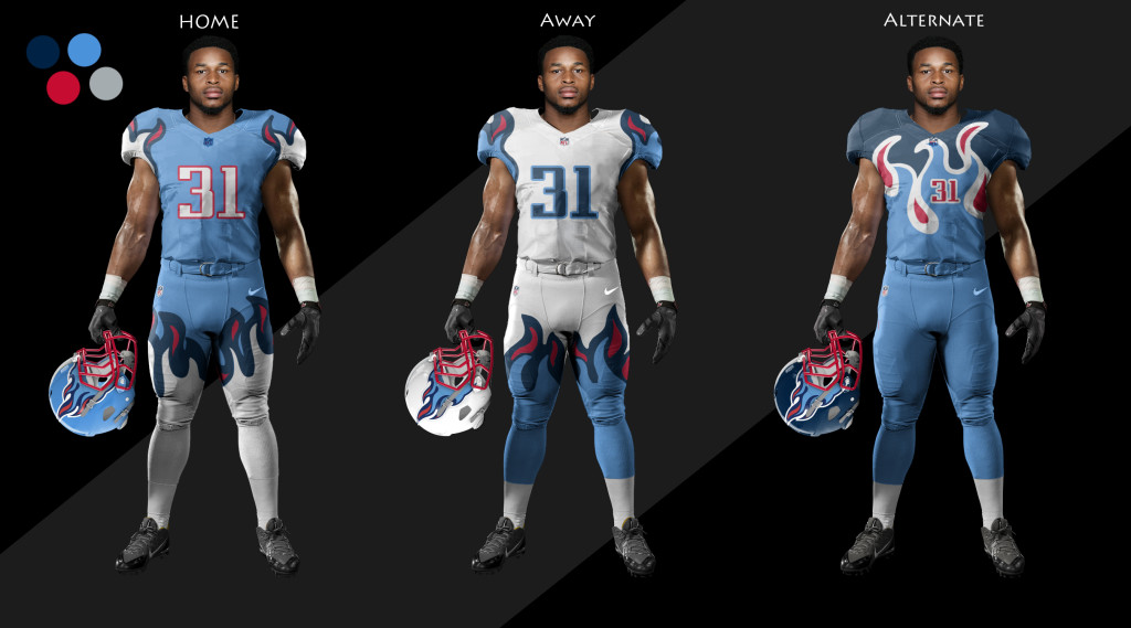
RAD FLAMES TELL ME THIS SHIT WOULDN’T RULE REALLY HARD. The Alt uniform is terrible but still rad. We have to expand our idea of what a football uniform can be.
ASYMMETRICAL SWORDS, BITCH
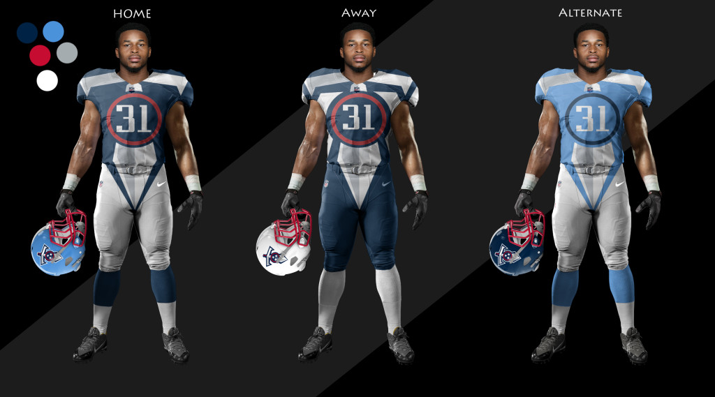
This one is the one that started as a big joke but actually kinda made me like it in the end. I took the sword logo and made it huge, and it then kinda fit the uniform better than expected, leaving a natural spot in the middle for the number. I think the middle away jersey could actually work. Kinda.
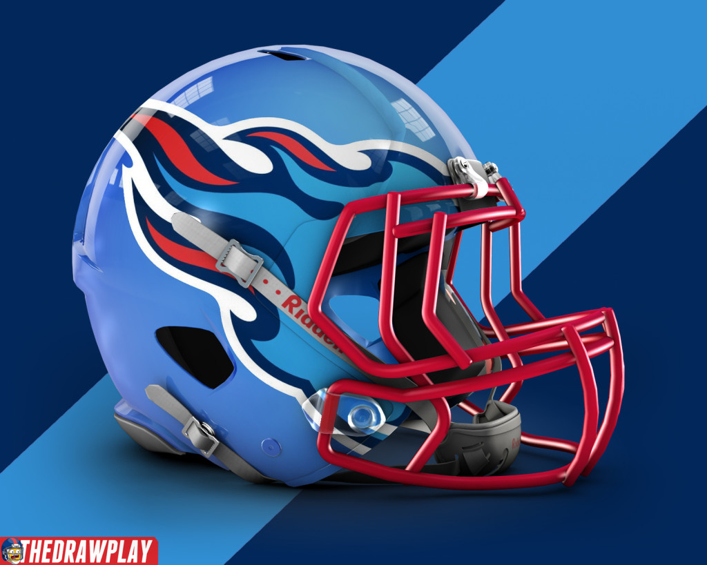
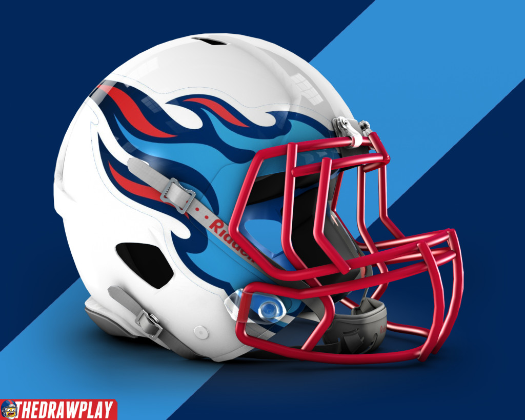
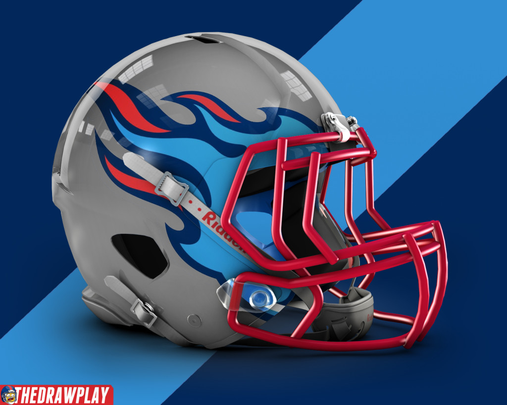
This is what I wish the Titans helmet looked like right now.
See? Making it just flames even makes the plain white helmet work better.
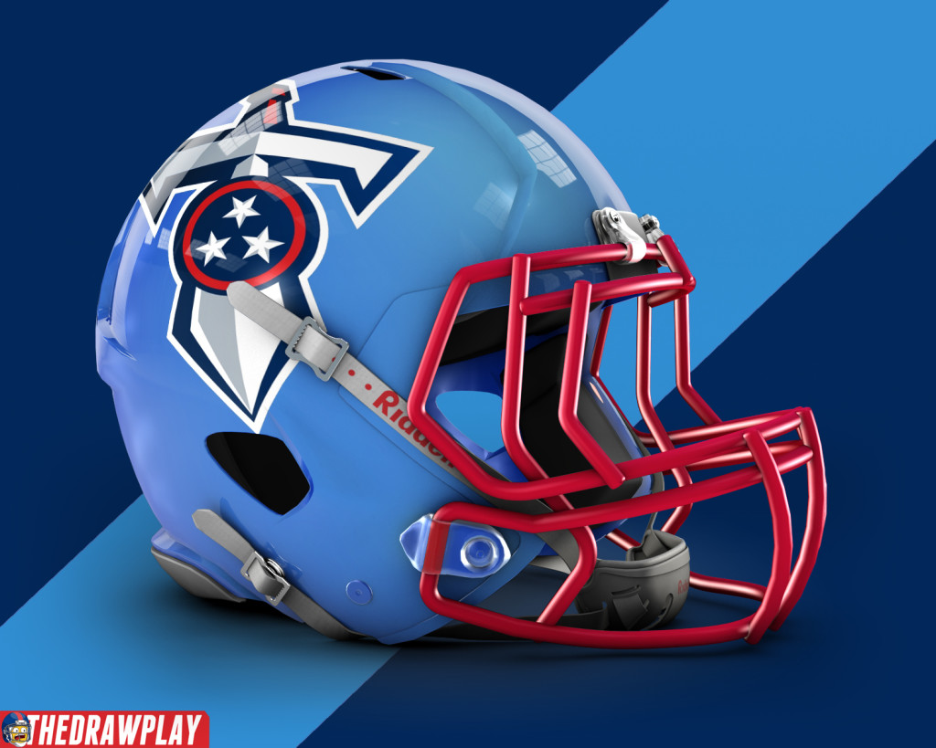
Sword logo, just to see. I think the comet actually curves around the helmet better.
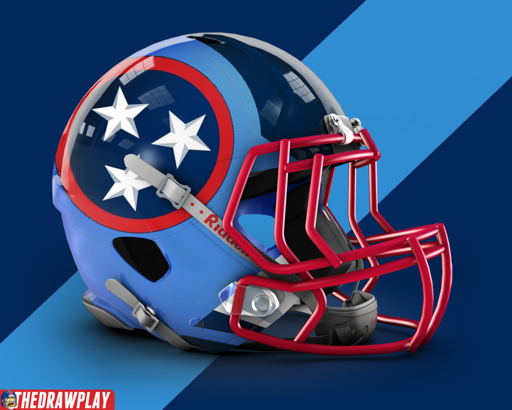
The circle and stars, just to see how it looked. tri-color helmet with hard edges because fuck the Jags gradient bullshit.
Make it look like an actual piece of armor a Titans could wear? Just a thought.
That’s that! The next thing to take the place of a comic will likely be for my annual draft cards. Normal comic comes back on Tuesday! Maybe Dez will be on a team by then.

I like the idea of an occasional change of pace. And good news, since the new jags unis are coming out next week you’ll have more uniforms to comment on and critique
All the Jags need to do is get rid of that silly helmet
Maybe, but Dave’s critique of the Jags helmet is one of my favorite things to come out from it. I’m hoping for more fuel for that fire.
wow those 21 drawings of Kevin Board look so realistic
This is a good point. Those jerseys look good on a jacked person, how would they look on a punter or a 350 lineman
?
Or you know, they could use the Oilers uniforms
The flaming skull helmets look really good. I also think I like the star shoulders jerseys the best (and I sort of like the flames ones as well, only I think the flames stopping right at the top of the things looks a little odd). The swords are just kind of a goofy and awkwardly big-looking thing to put on a jersey.
I love your designs way better than what they actually did. The 3rd and 5th models I wholeheartedly believe should be what they should consider. The sword models are very different than anything else you’d see in the NFL but I think they’re different in a very good way. The helmets…..I liked the old helmet. I don’t think white is bad. I thought how they used the white was bad. I prefer the lighter blue look you posted and the way you integrated the logo was perfect to me. As a Titans fan, I want your uniform designs over anything else they’ve given us since they moved to Tennessee.
Nice change of pace. One request if I may: I read thedrawplay from my phone 80% of the time. Anyway you can update the CSS for a mobile friendly view. The comic is fine but your posts and the pictures in them require me to zoom in and out a ton or opening the images in a new tab.
Love the grey helmet… Would look good with an all grey color rush or the baby blues.
Yo! If you mixed #3 with the stars on the shoulder pads with #5 flame pants! That would be super dope!
Star Shoulders: where’s the third star?
Sword-Peen: you can barely tell which one is the Away Whites.
I miss these, actually, as well as themed logo redesigns such as the Manningface and Trump logos. Would like to see these more often
Who knew Kevin byrd had so many identical twins
Like I said before, my life won’t be complete until I see the Titans go to Houston in Oilers throwback jerseys. I’m thinking they could use the powder blue uniforms as a way to slowly introduce the throwback uniforms back
I have always preferred an all white away look, but those stars are just too damn big.
I disagree with your comment that we need to expand out ideas of what a football uniform should be. You see, Hockey had a phase like that all through the late 80’s through the mid ’00’s, and what happened was not good. While many of them looked kinda interesting on paper NONE of them looked good, and they all ended up getting trashed sooner or later, except for Calgary, but thats a story for a different time. Don’t believe me? Obsoive:
I’ll go team by team.
Anaheim Ducks: http://www.sportslogos.net/logos/view/p9f7x6g3amgmu0c6fhp1/Mighty_Ducks_of_Anaheim/1996/Alternate_Uniform
Arizona Coyotes: http://www.sportslogos.net/logos/view/gsm60gq3xdgh9k4hv8cdf3eje/Phoenix_Coyotes/1999/Alternate_Uniform
Boston Bruins: http://www.sportslogos.net/logos/view/h5mx32o1esgycrrrgfr29wn4u/Boston_Bruins/1996/Alternate_Uniform
Buffalo Sabers:
http://www.sportslogos.net/logos/view/8rs7u7s4fgy87ohnmbgbqt4ln/Buffalo_Sabres/1997/Dark_Uniform
Calgary Flames: http://www.sportslogos.net/logos/view/ngpki2jusgh6u69bh8kmnfhor/Calgary_Flames/1995/Dark_Uniform
Carolina Hurricanes:
http://www.sportslogos.net/logos/view/wen7ryhxsm4w5rblkl1k0xkx4/Carolina_Hurricanes/2009/Alternate_Uniform
Chicago Blackhawks never changed their uniforms too much, kept consistent and cool.
Colorado Avalanche are kinda boring uniforms anyway, but they never became dumb, so at least they have that going for them.
Colombus Blue Jackets came into the league after the craze kinda wore down, never really had a chance to become gross. Except for the bug logo. That’s atrocious.
Dallas Stars: I kinda like these, but to my point: http://www.sportslogos.net/logos/view/1098141998/Dallas_Stars/1998/Alternate_Uniform
Detroit Red Wings never have changed their uniforms. Kudos for them.
Edmonton Oilers had some bad 2000’s uniforms and some stupid looking alternates, but nothing embarrassing.
Florida Panthers Unis were always Awesome.
LA Kings: look up “La kings burger kings” Eww.
Minnesota wild are in the same situation as the Blue Jackets.
Montreal Canadians: http://www.sportslogos.net/logos/view/kex3h1uwp4mhy5frq7r0fxper/Montreal_Canadiens/2009/Throwback_Uniform
Nashville Predators: http://www.sportslogos.net/logos/view/623nfh8uembe3hfyjgnggqxn9/Nashville_Predators/2002/Alternate_Uniform
New Jersey Devils Never got Weird.
New York Islanders: http://www.sportslogos.net/logos/view/gxfdfz1tfvzsz7rqo9s28dahq/New_York_Islanders/1996/Dark_Uniform
Worst uniforms ever.
New York Rangers Stayed Normal.
Ottawa Senators: http://www.sportslogos.net/logos/view/d87as14udjuziet8a30e6zo2t/Ottawa_Senators/1998/Alternate_Uniform
Philadelphia Flyers almost wore these. Thank Goodness they didn’t. https://www.rarevintagewear.com/2014/07/15/meet-the-philadelphia-flyers-third-jersey-that-never-hit-the-ice/
Pittsburgh Penguins: http://www.sportslogos.net/logos/view/emaz7ibs36tg6f7ay2se/Pittsburgh_Penguins/1998/Dark_Uniform
San Jose Sharks: http://www.sportslogos.net/logos/view/rjomtf1luu3z1meea9w1/San_Jose_Sharks/1999/Dark_Uniform
St. Louis Blues: Look up their Trumpet Jerseys. Eww.
Tampa Bay Lightening: http://evaluatethatjersey.blogspot.com/2013/10/tampa-bay-lightning-3rd-jersey-1996-1999.html
These Happened. This is the equivalent of what a super swordy uniform for the titans would look like.
Toronto Maple Leafs have always been classic.
Vancouver Canucks: http://www.sportslogos.net/logos/view/crzbe7ifuxfswbghuymrjdjg1/Vancouver_Canucks/1983/Dark_Uniform
I personally like these uniforms, but we see the “what a uniform can be” being toyed with.
The Vegas Golden Knights have only been a team for less than a year, no weirdness here.
Washington Capitals had these things: http://www.sportslogos.net/logos/view/hsh6l5wwwi9fee4q4zuud5cf5/Washington_Capitals/1996/Dark_Uniform
Winnipeg hasn’t been a team long enough to have gross unis, though the old Atlanta Thrashers had some bad uniforms.
I REST.
MY CASE.
Uniform structure and design just isn’t something that should be played with. I’m not a purist or anything, I like fun uniforms as much as the next guy, I just think that If you really try to mess with the basic structure you get stuff like these old NHL uniforms. They Just don’t look good. The trick is, if you’re not a team that has rights to a classic simple look like the Red Wings, the Packers, the Giants, The Flyers, the Chiefs, etc, is to find something that’s right on the edge between unique and EWW. I think the Titans did that. They made their uniforms different, but not too much that they were a failure. The Bucs and the Jags? they went too far. That’s eww. The Browns? They did good, and their uniforms would be a success if their previous uniforms weren’t great. The lions uniforms are just boring now. They don’t pop.
It’s not about being RAD and DIFFERENT and WOWing people. otherwise all teams would look like the Jags and the Bucs.
It’s about looking cool, comfortable, and most of all, simplistically unique. It’s a challenge, and that’s why lots of teams are still looking for their niche, but I think the Titans found it, I think they did great, and furthermore, found that simplistically unique look that will be a comfortable uniform to watch in the coming years.
Some of those were ugly. So much so, that I only remembered some of them after I saw them. It’s like my mind just blocked them all out. Except for Dallas. I liked theirs.
I appreciate the effort you went through for this but I like a lot of those. Also Hockey =/= football. Different structures to the jerseys, Hockey uniforms seem to have a lot of extra real estate. I think the mistake a lot of these made was too much detail. So far Nike hasn’t gone quite as far as putting a desert landscape on a jersey.
I notice that when you go into the major team redesigns you don’t mention the Hawks, which went probably farther than anyone so far and they look fantastic. Also the Lions, who you now call boring (I agree), didn’t go modern. They went old school and traditional and look bland now, which kind of goes against your point?
The Jags are honestly okay outside the helmet, which is being discontinued. The Bucs are just fine outside the dumb numbers. Nike is throwing stuff at the wall and seeing what sticks, and many of their attempts have broken the mold and actually done something good for future looks.
Also most of these are basically jokes, I do not actually want the flame jerseys.
Two things. One in counterpoint and one in slight agreement.
You say that Nike is throwing stuff at the wall to see what sticks. I agree. But notice the stuff that didn’t stick was stuff that was trying to expand the ideas. The two tone helmet had never been done before, they tried to expand their ideas and it fell totally flat. The alarm clock numbers were a cool new idea, trying to expand the idea of what numbers on jerseys could look like. It was bad. You say the Jags unis aren’t awful, I kinda agree, but the jerseys aren’t expanding any ideas of newness. They are normal structured uniforms with cool ideas thrown onto them.
As for the flame jerseys, I think the shoulder pads actually look cool and could work. The pants no. But the shoulder pas flames look sexy.
How about the Vikings matte helmet? That was a new idea, and it worked really good.
The Hawks weird leg patterns and shoulder stripes are new ideas, and they work.
The Titans sword shoulders are kinda new, and they work.
The Browns CLEVELAND across the chest looks kinda nice to me.
The Jags yellow collar stripe is good, nobody ever complains about that.
The Bucs shoulder pads look great to me, honestly.
So far Nike’s big failures are the Jags helmet, the Bucs numbers, and the Browns pants. All of those ideas weren’t bad, but the execution wasn’t good. I appreciate that they are trying. So far I think Nike’s most consistent issue is their new fonts. A lot of the new fonts are EXTREME and none of them have felt like an improvement.
What I am trying to say is not that new ideas are bad or that doing things out of the ordinary aren’t good. My point is that to change the structure of a jersey such that it loses the basic elements of what a uniform should be has never quite worked out.
Take the stripe along football pants for example, Some teams have one color stripe, some have two tone stripes, some have curvy slashy things like the Panthers, some have a thing like the Seahawks, and come teams have none, but there is always that basic look of some sort of stripe along the pants. Within that realm of a stripe, one can do many things, but the point is it’s still there.
Pants are always one color aside from the stripe, a two tone pant look would be strange and isn’t used. Not saying it wouldn’t work, but withing the realm of what football pants are, there’s this standard template that is used. You can do whatever you want within it, but if you were to stray outside of that template, it would look strange.
Numbers have many fonts and shapes and whatnot, but they are always there, big on the front and back of a jersey.
Helmets have a basic design, one color, logo, optional stripe. The Bengals and the Eagles have cool things on their helmets, but that’s their logo essentially. Once you stray out of that template, you enter a realm of uncertainty.
The Bucs made different shoulder pads, they look different but are still in that template of the shoulder yolk.
Titans sword shoulders are great, because WITHIN the basic yolk design they made a cool variation.
The neck thingy on the Jags unis takes a cool spin on the neck area. That one is different, but not major enough to change the entire flow of the uniform.
My point is, new ideas and variations aren’t bad, they’re good! it’s just when you start venturing so far outside the basic template that the uniform is strange and confusing to look at. Colors, yolks, vests, shoulder stripes, shoulder designs rather, all of them can be changed and designed in any way that one wants, but it is once someone decides to do something so far outside that norm that the uniform doesn’t flow well and it looks more like a gimmick than a neat design.
New = Good
Gimmicks = Bad
I don’t think it has anything to do with gimmicky ideas or designs. I think it’s basically all execution and people resisting change.
The matte helmet for the Vikings is just as much of a gimmick as the Jags gradient, and as the Bucs big logo helmet. Those changes are all equal in uniform structure to me, but the Jags helmet is the only one people hate. Why? Because it was done poorly. Execution matters more than anything.
I also find it interesting that the Hawks redesign changed a lot of what was considered conventional (Pants and jersey same color, the odd shapes on the pants, the horizontal shoulder stripes, the helmet texture, the textured numbers) and everyone was mostly okay with it. The Hawks also have a large contingent of new fans who likely weren’t married to the old looks, so they didn’t have traditionalist expectations and just embraced this new style in this new era of success.
It also helps that the new look is better than the old look and was executed well. The Hawks new uniform elements all work together very well, where the Bucs and Jags have a lot of new elements that don’t have nearly as much cohesion and feel like just new elements for the sake of new. The Browns new look is actually good, but it replaced a better look and the pants thing is meh, should have been smaller. I think I might go into more thought on this when the Jags changes are shown off soon.
I think this is why I love color rush. Some of those uniforms are garbage and they need to change the sock colors to avoid looking like onsies. But some of the stuff we saw I really liked. A few tweaks and some of those uniforms were superior looks. But I’m a huge fan of pants and jerseys as the same color. Looks more like an actual uniform that way.
Hey cool, you used the template I made! The original player was Doug Martin in the Tampa Bay Buccs uni.
I like the sword one the best, just leave the sword off the pants.
If you wanna use them I have a whole bunch of templates for football cards.
All of these: https://www.flickr.com/photos/85438266@N06/
It is a good template, thank you for sharing it way back when bro
I want so many swords that the uni looks like the Iron Throne in GoT
Teams should start incorporating parts of their logos into uniforms other than the helmet, that would look incredible, Titans flame uniforms are very nice btw
I dig the light blue flame helmet. Add that with the light blue jersey and the red border on the numbers, and you have a modern take on the classic Oilers uniform.
I know this is a long while away, but were you planning on continuing your Christmas Cards for each division? I really loved them, but the last ones you made were back in 2016, wasn’t sure if you didn’t want to make them or didn’t have time, or something else. Regardless, would love to see you get back into them, and can’t wait for these draft cards. DRAFT IN LESS THAN 2 WEEKS IM SO HYPE
Those flame helmets are fire!!!!
Those big sword ones seem to want to draw attention to their…big swords? *cringe*