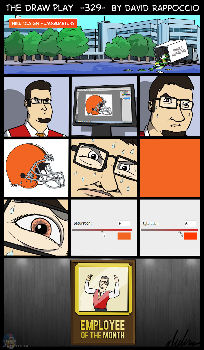
Designing the new Browns colors
I think it’s hilarious that we were basically strung along for weeks in anticipation of the unveiling of the new Browns logo and after all this time we get a brown facemask, a slightly more saturated orange, and a new Dawg Pound logo which looks like an adorable looney tunes puppy.
Honestly I wasn’t surprised they didn’t change much. The Browns have such a classic look that despite all of Nike’s bluster about the big changes incoming, I don’t see much changing. The Browns have used the same basic look for their entire history, I can’t see Nike doing much more than small color changes and maybe some slightly new design elements to the uniform. I assume the new orange will be on the uniform, and I assume the brown facemask (which I like) will also be incorporated. I’m guessing the uniform will still be Brown, with orange and white stripes on the shoulders. If Nike does anything fancy it’s going to be done to the pants. Maybe weird stripes or something goofy like the things on the Seahawks pants. I actually think the Browns uniforms will end up good, they have a solid color base to work on, a solid basic design in place, and I doubt a place as proud of their team history as Cleveland is going to allow anything too radical. Unless maybe Haslam has truly lost his mind.
We’ll see the new uniforms on April 14th if the source I read was correct, and I’m actually pretty interested. Nike is hit or miss for me with their changes, and so far I like the Browns minor changes so we’ll see.


The elusive football/Photoshop crossover joke.
Common orange pants!
HOW DARE YOU INSULT ADOBE PHOTOSHOP, THE GOD OF ALL PHOTO EDITING SOFTWARE…….
That’s it! I’m telling Adobe about this……
(PS: Just kidding)
When are we going to get another baby on fire?
oh good, those ducks uniforms are being released back into the wild, i was worried about that
With that was a change for Chomps. Oh boy.
How ironic that he upped the saturation +6 in Photoshop, and -25 on his eyes.
Someone said I had orange eyes once. ō_Ó
Come on now… He also changed the facemask color to brown.
The Brown remains unchanged
As of this comic, typing “thed” into my browser returns this site instead of “thedailyshow.com”… my browser likes you more than Jon Stewart now.
I don’t know why but it bothers me that the Jaguars helmet comic isn’t in the related comics section
That section is literally completely random, seems kind of pointless.
Ah, I didn’t realize it was randomized.
Independent graphic design: amazing digital artwork that stretches the boundaries of design.
Private corporate graphic design: increase saturation, add a gradient, and plop on a filter.
LOL @ the Ducks dump truck. Dying. hahaha
Like the cash money signs of failed manziel experiment tossed in now josh McCown oh dam the Browns moving up in the world for level one to 0-16 I fell bad for joe Haden and joe Thomas and Mack only people there that are elite (I mean josh Gordon cough cough) and they are stuck in abyss I’d rather be a raider than Browns or a jag heck I’d rather be a zombie buc or a nameless icon less Titan than the Browns……oh yea this was about their logo glad that some things never change oh wait talking about Browns here they are always the same losing disfunctional and can’t do anything even with high cap space and draft picks….ok tangent done….this is coming from a pats/panthers fan so I guess I’m a little spoiled but Panthers kinda feel just an ounce of browns pain