Russell Wilson’s New Logo
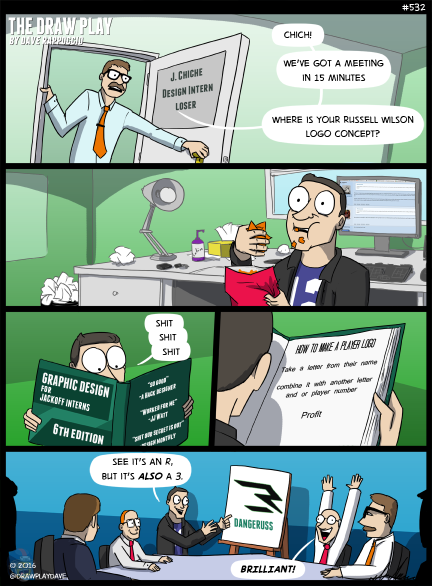
Goddamnit Russ. Why don’t you listen to me? Didn’t you hear me when I spent an entire post on this just two weeks ago because of JJ Watt? Didn’t you read that? Didn’t you maybe see that and go…”Hey, maybe I should try to do something different and unique?” Nope. You didn’t. And now, two weeks after I spent a podcast and a comic detailing what players need to stop doing for personal logos, you do this. Damn you, you tiny little brand machine. Damn you.
It’s seriously all the same problems all over again. I’m beginning to think that design firms always send the player logo jobs to the same guy, tucked away in the farthest cubicle. Mr. Jim or whoever he is just sits around looking at porn all day, then gets a new request for a logo. He takes the first letter of that player’s name and puts it in photoshop, then adds a small slant to it, and then adds another line or two to make it look like two letters at once. Boom, 5 minutes of work.
Taken individually his logo is…eh. I would like it better if it was just the R without the little line to make it a 3. The problem is not the individual logos, it’s the boring trend of this being basically every player logo. It’s boring. I can’t wait till someone does something actually interesting. Note to readers who want to build a personal brand: don’t do this with your logo. Do something unique, do something different. Even if it’s a little goofy, what you want is recognition and unique logos do that. My little screaming football man logo is one of the things I’m more proud about making, because I think at this point it’s a good representation of my stuff and myself. It’s not perfect, but I think if you saw my logo bunched in with a lot of player logos, mine would stick out, and that’s what matters.
I’m also surprised it took Russ this long to get a logo. Dude has been a corporate brand robot since he got into the league. I don’t know if he has a personality or if he gets a new update downloaded every night when they plug him in. Part of me thinks he didn’t have sex with Ciara not because he didn’t want to, but because she actually considers him a very large vibrator and not another person that she can truly experience intimacy with.


>a very large vibrator
well, not *too* large, this is Russell Wilson…
Honestly, it looks more like “-?” than an R or a 3. Feels like -? also kind of represents my sentiments regarding it.
I somehow hate this design even more than JJ’s.
I guess Future wins this round after reading that
I could’ve done that in MSPaint
It also kinda looks like a W if you turn it sideways.
Honestly I feel like Beast Mode started this trend, and I still feel like his logo holds up. It’s kinda cool and Lynch is whacky enough to do different things with it. That being said, it’s just a to slap your name on a peice of merch.
Also it’s better than #7torm.
I wonder if Dave has similar issues with the Dez Bryant “ThrowUpTheX” logo. At least there a tag line to go with it.
Such a shitty design book that the cover is on backwards.
Remember when people made fun of Prince’s symbol? This is the alternative…
I hope those people are happy about what they wrought.
I like this logo. Bland, soulless, and corporate. It represents Wilson pretty accurately.
I honestly wonder who buys merchandise with these logos on them. If you want to rep Russell Wilson, you go and buy a Russell Wilson jersey. You don’t buy something with this goofy R/3 hybrid on it which no one will recognize anyway.
Seahawks fans have known Russell is a robot for years. A sweet, sexy, robotic hunk of synthetic man meat. You haven’t stumbled onto a conspiracy, Dave, this is already public knowledge.
I’m really showing my age I guess — wth does an individual player need a bloody logo for?
#Branding mainly
If Eli made a logo it should be a rocket pop in the shape of the number 10.
It would be his name in finger paint with the E written adorably backwards.
You should be tabbed to make logos for players, considering how glorious your Rex Grossman Sex Cannon is.
https://uproxx.files.wordpress.com/2015/08/newlogo.png?w=650&h=588
I still want that on a shirt
That Actually is good.
Haters will say it’s fake
I still want that on a shirt